250 Waterloo Road
Getting sweary in SW1

250 Waterloo Road offered a unique, lip-smacking challenge. The client wanted a brand that would not only establish Waterloo as a great destination but stand out among competing office space. This brand needed a tone of voice with more bite than a great white shark.

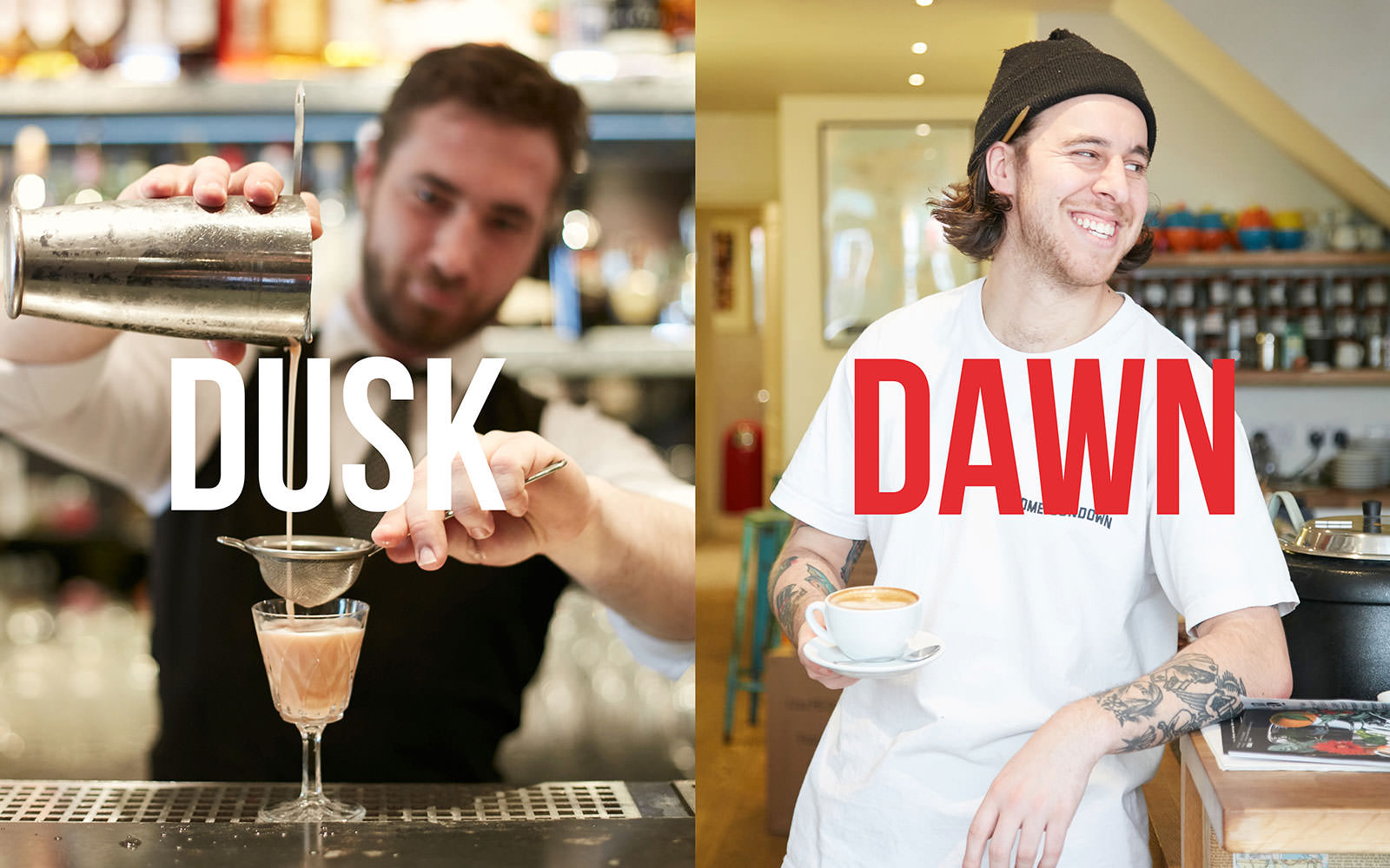
Against the expense, sterility and pretension of other London hubs, Waterloo stands out for its no-bollocks cultural scene and understated eating and dining venues, not to mention its speedy transport links.

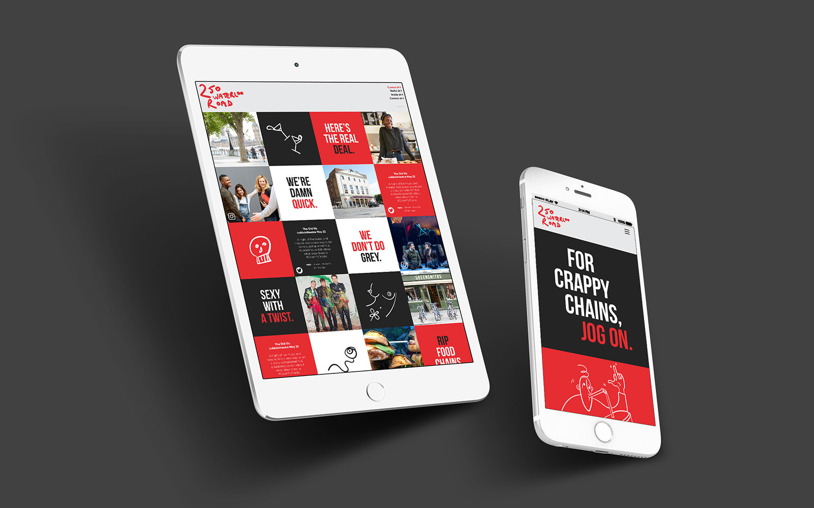
bandstand designed and built the brochure, website and emails. We populated them with our illustrations and copy which were marked by a defiant, punkish attitude, unafraid to take on other parts of the capital while highlighting everything great about Waterloo.
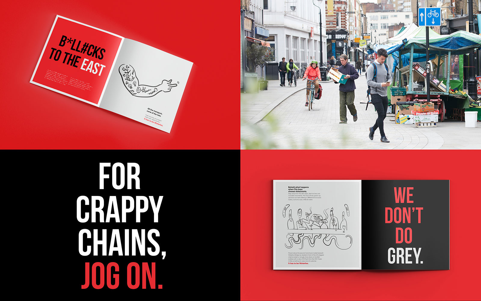
Our designer Ioana originally snuck a penis into the 250 Waterloo designs. It was withdrawn in favour of bog roll, hairy feet and a nipple or three.
The result: a bold campaign that clients would remember and that would firmly stick Waterloo’s flag (well, middle finger) in the ground.

44% click-through rate on initial email

- Brand development
- Brand guidelines
- Brochure
- Illustration
- Strategy
- Website